Friday, 4 May 2012
Final Digipak


As you can see on the digipak, we used several indie record labels to give the impression that this was a signed band. We uses Sell-a-Lot Records for the actual record label, ioda for the production company label and yeproc records for the distribution company label.


Thursday, 3 May 2012
Evaluation Question 1
In What Ways Does Your Media Product Use, Develop Or Challenge Forms And Conventions Of Real Media Products?
For this task, we decided to find firstly the conventions seen in music video as a whole, and then the conventions we see commonly in our chosen genre, which is Alternative rock.
Music Video Conventions:
For our magazine ad we again looked at adverts from our genre, and some from other genres of music video. For example, the inspiration found for our font style was seen in an advertisement for Kyle Park, who is a country singer, which is a totally different genre to indie/alternative rock. Both this advertisement and the advertisement for Arctic Monkeys: Favourite Worst Nightmare gave us inspiration as both of these ads had artwork on the left, and the key text on the right, which can be seen in our work. This layout is prominent as the image that draws the attention is first seen, on the left, before a closer look at the ad can give the audience the finer details about the band and the product being sold.
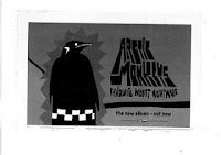

For our digipak, we again took inspiration from Arctic Monkeys, this time focusing on their use of black and white colour scheme, whilst using basic images with small amounts of editing. This enhances the overall product as the chosen image is a strong one, and then the editing performed adds value to the product.

Although our idea is different to that used on this album, you can see that using the same shot with different editing can be very effective.
For this task, we decided to find firstly the conventions seen in music video as a whole, and then the conventions we see commonly in our chosen genre, which is Alternative rock.
Music Video Conventions:
- Fast Paced Editing
- 3 Types Of Music Video - Narrative, Performance or Concept (A lot of today's music videos are hybrids of the 3 different styles, often including both performance and narrative)
- Lip Syncing
- Match On Action
- Distinct Setting
Conventions seen in our genre:
- Fast paced editing and match on action
- Distinct and vivid setting
- Hybrid of the 3 types of music video, rarely just narrative or performance
- Focus on the lead singer is common to the Rock genre as a whole, not to mention sub-genres
Magazine Advertisement Conventions:
- Tour Dates
- Reviews - of the band or the album advertised usually
- Band Information - such as twitter and facebook links, QR codes to band web pages
- Music Label details and Copyright symbols
- Possibly an image of the band, if the artwork is not already of them
- Image of the CD cover, with 'Out Now' next to it, to further promote the album
Conventions seen in our genre:
- Tour dates and reviews are especially common
- Label details and Band info
- Artwork, it is usually concept art and not of the band
Digipak Conventions:
- Paperboard design style
- Band or concept art as a theme, and not a mixture of both
- Booklet and booklet sleeve
- Web info - which we found increasingly common in today's CD albums and digipak products.
- Track List, Album Name and Band Name
Conventions seen in our genre:
- Band or images, artwork is rare
- Track List, Album Name and Band Name
- Web Info
- Booklet and Booklet Sleeve
One band we focused our attention on was the band Arctic Monkeys. Many of their music videos are concept videos, like ours, and their advertisements and CD covers do replicate some of our final work.
Whilst both myself and George's job was to analyse work from our chosen genre and sub genre, which is rock, furthered by alternative rock, we did pay particular attention to this band due to their success and high following, George especially.
Whilst both myself and George's job was to analyse work from our chosen genre and sub genre, which is rock, furthered by alternative rock, we did pay particular attention to this band due to their success and high following, George especially.
For the music video, as seen in 'Teddy Picker', we emulated a lot of the performance shots used by using shaky, natural camera work, which is seen in many alternative band's videos, let alone a band we had particular focus on. The narrative aspect of our music video was based around many videos in today's music, in which there is usually focus on a romance, to which we adapted to it being a lost romance, between people in our age range in order to relate to our target audience.
As you can see the shots we took in this all performance cut of our video do emulate the ones in 'Teddy Picker':
For our magazine ad we again looked at adverts from our genre, and some from other genres of music video. For example, the inspiration found for our font style was seen in an advertisement for Kyle Park, who is a country singer, which is a totally different genre to indie/alternative rock. Both this advertisement and the advertisement for Arctic Monkeys: Favourite Worst Nightmare gave us inspiration as both of these ads had artwork on the left, and the key text on the right, which can be seen in our work. This layout is prominent as the image that draws the attention is first seen, on the left, before a closer look at the ad can give the audience the finer details about the band and the product being sold.

 |
| As you can see we have emulated work both from our chosen genre and ad conventions on a whole |

Although our idea is different to that used on this album, you can see that using the same shot with different editing can be very effective.
Evaluation Question 2
How Effective Is The Combination Of Your Main Products And Ancillary Texts?
What ancillary texts we used:


What ancillary texts we used:
- QR code - scanner for smartphones which links to a performance cut of the music video
- Viral Advertisement, with the QR code on - provides audience intrigue and interest
- Magazine AD
- Digipak
- Music Vid - main product
- Blog
- Twitter Account
We believe the QR code and viral advertisements were effective as they added a lot of enigma and intrigue to our products, with the barcode scan being a focal point for us. This is an example of social media integration as it interacts the audience, and the fact that the viral advertisement, as seen in my evaluation video, is lacking any real text or info on, the barcode should provide our audience with reason to scan and find out more.
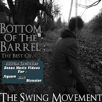
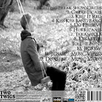
The digipak was a key ancillary text for us as not only was it a sub project for the whole task, but it was essentially what the magazine ad was promoting, so it was very important. The cover can be seen on the magazine ad, as well as the cover linking to the ad itself therefore giving the audience a greater opportunity to recognise and relate all the products together. The microphone shot we have used for inside panels is very similar to shots seen in the video, aside from the editing to the image for the panels, and this is again a recognisable thing for the audience to see, not to mention the band being edited into this. One other aspect of recognisability is the track listings, in which the audience can see not only the bonus music video content but other songs, and they may recognise these pieces, encouraging to purchase the product.
 |
| Back Cover |
 |
| Front Cover |
 |
| Spine |


For our magazine ad, we used a very similar shot to the digipak, thus relating the products so the audience can remember these as a set of products promoting the same thing. There is a QR code seen on both products which again connects us into today's social media.
The blog both samples and promotes our work, whilst also updating our audience on news about our products. They can find inspirations for our work, feedback for our work and answer polls. This helps us interact with the audience, and we can also give excessive info on all our products and ancillary texts used. The twitter feed is another way to interact with the audience and promote our products and ancillary texts.
The music video itself is heavily connected to the ancillary texts, to begin with we have based the idea for both the digipak and the magazine ad around the band's name, highlighting the 'Swing' part of 'The Swing Movement'. We played on this and initially intended to have myself on the swing due to my role in the music video, which would have made a lot more sense to the audience. However, due to other commitments we were running out of time and George had to step in and take the place, although we tried to make the images, for the magazine ad at least, give the impression that it could be a member of the band or be a generic character that can be related to, with him sat on a swing conveying he is thinking and is at the 'Bottom Of The Barrel'
Evaluation Question 3
What Have You Learned From Your Audience Feedback?
What audience feedback we recieved:


In our case, the music and the performance was an attracive selling point for the males, whilst the romantic narrative was a key drawing point for the females. One clothing change we made in relation to this was to make the girl wear a red jacket in the happy scenes, to signify love and romance, thus attracting an appeal from an audience that enjoy aspects of the romantic genre.
For our rough cuts the feedback we recieved was mostly positive and only minor changes were decided to be needed. Clothing changes such as shoes and coats were changed, especially on the male character, whilst other feedback on performance footage being shot on the side also taken into consideration. It helped that the most of our feedback was given by fellow 6th form students, making the feedback even more important as it was from both our primary and secondary audiences, so the product is relatable. Several youtube users also gave their opinions which helped us gain feedback from a wider community.
George also had the initiative to enter the video in a music video competition, to which the video won, allowing us to see that our work had been a success. This allowed us to gain feedback from people in the industry, and the fact that they chose it as a winner shows our work has been recognised and praised by these people. These people are also likely to be members of our wider audience and not in our primary and secondary audiences, so again it was useful to see that the product has been a success in these more diverse parts of our audience.
We made a twitter account for our production company, which was a success and we gained a few followers. This gave production updates and people could tweet to the account to see any progress updates or other important news, they could also send feedback here, showcasing the use of social media integration.
The QR code also played a major part in our feedback as it directed people to the performance footage, so people could leave us feedback on the youtube page.
What audience feedback we recieved:
- 3 full rough cut screenings with feedback afterward
- Full performance cut of our video
- Submission into music competition
- Twitter followers
- QR code views
- Blog hits and polls


In our case, the music and the performance was an attracive selling point for the males, whilst the romantic narrative was a key drawing point for the females. One clothing change we made in relation to this was to make the girl wear a red jacket in the happy scenes, to signify love and romance, thus attracting an appeal from an audience that enjoy aspects of the romantic genre.
For our rough cuts the feedback we recieved was mostly positive and only minor changes were decided to be needed. Clothing changes such as shoes and coats were changed, especially on the male character, whilst other feedback on performance footage being shot on the side also taken into consideration. It helped that the most of our feedback was given by fellow 6th form students, making the feedback even more important as it was from both our primary and secondary audiences, so the product is relatable. Several youtube users also gave their opinions which helped us gain feedback from a wider community.
George also had the initiative to enter the video in a music video competition, to which the video won, allowing us to see that our work had been a success. This allowed us to gain feedback from people in the industry, and the fact that they chose it as a winner shows our work has been recognised and praised by these people. These people are also likely to be members of our wider audience and not in our primary and secondary audiences, so again it was useful to see that the product has been a success in these more diverse parts of our audience.
We made a twitter account for our production company, which was a success and we gained a few followers. This gave production updates and people could tweet to the account to see any progress updates or other important news, they could also send feedback here, showcasing the use of social media integration.
The QR code also played a major part in our feedback as it directed people to the performance footage, so people could leave us feedback on the youtube page.
Evaluation Question 4
How did you use new media technologies in the construction and research, planning and evaluation stages?
What aspects of new media we used:
- Digipaks
- Viral advertisements
- Magazine advertisements
- Music video competition
- Online Feedback
- Blogs
- Nikon D-300S
- Photoshop Elements
- Final Cut Express
- iMovie
SCREENSHOT OF CAMERA
Photoshop was also an important technology we used in the construction process of our products, namely in both our ancillary texts. Although my skills on photopshop were fairly limited, it was still a key technology in both drafting and then completeing our final digipak and magine advertisements. The application made the editing of these products a lot easier, and improved the quality also.
In making the digipak and mag ad, tusing the auto correct and auto sharpen tools were how I began the processes, as it immediately rendered the photo into looking completely different and unique, before I converted it into black and white, going with teh newspaper effect for the magazine ad, and the infared effect for the digipak. I then proceeded to crop the phot and then used the magnetic lassoo tool to select key parts of the photo, in order to layer them and give the swing impression that can be seen on both the covers of the digipak.
We differed in style as the layers on the magazine ad had colour on in order to attract the audience's eye, but we kept the product basic, which is an indie convention, and remained in black and white on the digipak.
For the spine of the digipak, I used the clone stamp tool to get some of the indie background seen in the front cover, and then used this as it looked very effective, whilst also being a connecter between the front and back covers, as the background was the same on both sides, albeit on the back cover it being extremely lighter, to contrast the front.
Finally, the opacity had to be reduced on some layers., and then they had to be both locked and linked together, in order to merge together so the product could be once again cropped before it was finally ready.
iMovie was particularly useful for our rough cuts, as we could draft them out on this application, and prepare the video before the important editing such as cross cutting could be done on Final Cut. Without iMovie we would have gone into the key construction stage of the music video with a vague picture of how we wanted our shots to be organised, so it was key to our planning stages
Our blogs were key to our research and planning stages as it was on here that we could convey our ideas, inspirations and industry convention analysis'. They also helped us integrate facebook, twitter, and youtube into our final product which was a benefit when evidencing.
Final Cut - On final cut we had to order clips, cut them and add layers or transitions to them. George managed to find many key transitions, such as an out of focus shot that would go into the next one, which became key in our music video when we incorporated the idea of using flashbacks. Cross cutting can be seen towards the end of our video and this again was a key part of the editing process. It was also essential to use final cut in order to extract audio from the narrative and performance clips, and layer the music track onto it so that is all that could be heard.
The music video competition George submitted the video to was useful in the research and planning stages as we got genuine feedback from people in the industry and therefore this feedback was taken with extreme consideration as if they enjoyed the product, then we knew we were doing a good job. It also allowed to have added screenings and gave the video more views than it would have done had it not been submitted.
Thursday, 26 April 2012
Digipak and Mag Ad Feedback
For the digipak and magazine ad, we got told that:
- We needed to add 'Presents' to the magazine ad, in order to make it clear which text was the band's title
- Add the digipak cover to the magazine ad
- Add an 'includes' sticker to the digipak front cover
- Add more small print to the digipak cover and to look at conventions of other band's digipaks
- Include music videos to the track listings and track timings to the booklet
- add indie record labels to the digipak to give the impression this was a signed band
Casting
Our cast members were chosen to fit the age range of our target audience, therefore we selected from our age range, to relate to this audience. We then from people who could meet our tight schedule of filming, to which we decided to include myself in the narrative side of the video, due to me always being there when we needed to film. This saved a lot of time and effort in casting as we were also confident I could do a good job in my acting role.
We picked the girl by deciding who could portray a good match for the male character on screen, and we decided that Katie, who we eventually cast, was a good enough actor to give that impression to the audience.
We picked the girl by deciding who could portray a good match for the male character on screen, and we decided that Katie, who we eventually cast, was a good enough actor to give that impression to the audience.
Location
For our music video, we have decided to shoot the performance footage in the George's basement. This is because lots of indie music videos use a distinct setting, and we believe the idea of filming in a basement gives the impression that the band are just regular and are trying to make it in the industry, like many other bands out there. This in itself is quite a distinct and indie thing to do.
For the narrative scenes, we used George's house as it gave the impression that this couple were happy together and had a stable home, whilst using other locations such as the park and the river to show how, especially at the river, distinct settings can produce wild reactions, such as the slap at the river. The outdoor settings were used to diversify the couples' activities and interests, showing the audience that this couple could do anything together and had something special.
For the narrative scenes, we used George's house as it gave the impression that this couple were happy together and had a stable home, whilst using other locations such as the park and the river to show how, especially at the river, distinct settings can produce wild reactions, such as the slap at the river. The outdoor settings were used to diversify the couples' activities and interests, showing the audience that this couple could do anything together and had something special.
Monday, 16 April 2012
Digipak And Mag Ad Completion
Our digipak and magazine ads have been finalised and this means that they will be up on the blog shortly, subject to feedback.
Magazine Ad Deconstruction 4 Artic Monkeys - Inspiration
Artic Monkeys are both extremely successful and popular in the alternative rock genre so we took special influence from their work as it has proven to be a success, we feel with their formatting an audience could relate the two advertisements and therefore give us stronger genre links in the wider perspective.
GG - Filming complete
We are now confident that we have finished all the filming we need for our music video. We have had to do endless re-shoots and numerous rough cut edits but, this has only helped us make sure we produce the best video we can.
We have taken into account all the audience feedback we received from our class mates and friends. The main changes we have made are; instead of 3 scenarios there are now 5, we will use less of the performance footage and we have improved our framing of shots.
We have imported all of our shots into Final Cut and now plan to start our final edit.
GG - Digipak and Mag ad photo's
We have managed to get the photo's for our digipak and magazine ad done. Our idea was to find a swing on its own and in a run down area. After weeks of searching we found one that fit the bill and manage to take some photos.

 The plan for our digipak is to have a shot of a person of the swing from the front (front panel) and the same shot from behind (back panel)


 The plan for our digipak is to have a shot of a person of the swing from the front (front panel) and the same shot from behind (back panel)
For our magazine ad we plan to use the image to the left whilst adding text and other small images of the digipak.
All photos were taken by John Gamble: http://www.flickr.com/photos/johngamblesnaps/
GG - One Shot Performance vid
Here is a video of Jigsaw by The Swing Movement, edited on Final Cut and filmed on a Nikon D300s by George. It all all one shot with audio put in during the editing.
GG - Change in narrative
After receiving our audience feedback we have decided to add two more scenario's to our music video. This will bring the overall to five, plus performance. The idea is to have 3 of the 5 scenario's to end in an argument, and 2 to end well. We are going to keep the original three, but film two more.
Our idea is to have the couple walking beside a river hand in hand, they will also feed the ducks etc.. This will be happy memory. Our second new idea is for them both to be having a meal together, for the females birthday. This will build up to an argument after the female glances at the males phone as he is texting someone.
Instead of having all the memory's coming from the photos, we have decided to use objects in the room to create the memory. For example, a birthday card which leads to the memory of the birthday meal. The card will be in a bin, then we will cross cut to the memory.
TW - Magazine Ad Deconstruction 3 Kyle Park - Inspiration
Thursday, 1 March 2012
Blog Changes To Be Made
Before the deadline for blog marking, it has been brought to our attention that we need to notify changes to the blog that will be made, however not until after marking. These changes are as follows:
- Vodcasts need to be uploaded onto the blog - this will be completed next week
- Podcasts also need to be uploaded, however not as many as there are vodcasts - again, this will be completed next week
- Final draft of digipak and magazine ads (our progress in this has been halted due to location scouting problems)
We expect all these problems to be ammended by at most a fortnight, although we do believe we can achieve these goals, and changes that need to be made to our final cut, in the coming week.
GG - Editing vid on iMovie
 |
| Video Effects |
I found editing on iMovie very simple, this may be down to its lack of special effects available but for what we needed, it was perfect!
I started off by selecting all the clips I wanted from the events section and moved them into the project itself. This was very time consuming due to all the shots having to fit to the audio. In between shots I inserted transitions during selected sections, these were mainly used to show a flashback or a memory.
Once all the shots were in place, I went about removing all the original audio from the clips, this again was very time consuming.
 |
| Changing the Saturation |

This is our final edit in iMovie and now we hope to move onto using Final Cut to incorporate the cross cut effect.
GG - Things to be done
We are fast approaching the deadline day for all work to be handed up. Me and Tom have looked at what needs to be done and have made a plan.
- The Digipak needs finalising, all we need is an image of a swing form the front and back then we can get finishing our digipak. Tom will be mainly working on this.
- After a few drafts for the magazine ad we need to create a final version, I have a good idea of what I want it to look like and will hopefully have it done by the end of next week.
- We need to shoot one more scenario showing more conflict between the couple on screen.
- Do a rough cut on final cut, not just iMovie, here we can use cross fading shots etc..
Now we have got a plan I believe we can get all the work finished off.
Thursday, 23 February 2012
GG - Attracting to our target audience
In the post I am going to look at hour,in our third rough cut, we have used locations, clothing, actions etc.. to help appeal to our primary target audience of 15-24.
With the narrative being based around a relationship, it is around this age where romance starts playing a big role in someones life. People experience break-ups and can relate to the experience viewed on screen. This also helps us appeal to our secondary audience, females, through the use of a 'rom-com' like genre being used. One of the clothing codes we decided on was for the female to be wearing a red jacket in the first scenario. After playing around with colouring and layering whilst editing, I managed to make the jacket significantly stand out. The idea was to make it signify romance and love, thus further linking it to our secondary audience.
We filming both our actors, I asked them to act as if I wasn't there, then I went around filming them from a range of different angles. This makes the shots more believable, as if they are closely connected to one another.
We used two actors for the narrative within this age gap, although as you can see we try to avoid showing to much of them on screen to help create a narrative enigma.
Overall, I believe that we have managed to attracting our target audience well. There is still work that needs to be done whilst editing but after that I believe our main/primary target audience will be ableto ralte closely to the video.
Wednesday, 22 February 2012
TW - Magazine Ad - Plans
For our magazine advert, we have decided to incorporate some of our plans for our digipak, which is using the image of the swing, as this shot can be very distinctive, eye catching and unusual, which would meet a trend of distinctive images used in alternative genre music advertisements. (see Arctic Monkeys and Hard Fi early analysis).
The swing would be in an environment highlighted in my Replica blog post, and would be the only thing on the advertisement, except for band name, album title and possibly an 'includes' sticker/snippet in order to give the album more of a selling point. It would also include the production logos and copyright logos in a corner so they don't attract too much attention but are still visible in the advertisement.
The swing would be in an environment highlighted in my Replica blog post, and would be the only thing on the advertisement, except for band name, album title and possibly an 'includes' sticker/snippet in order to give the album more of a selling point. It would also include the production logos and copyright logos in a corner so they don't attract too much attention but are still visible in the advertisement.
TW - Filming
We managed to film everything we needed on Monday 20th February to have a new rough cut available for audience feedback. We expect the rough cut to be completed soon and screened for feedback approximately on Thursday.
Sunday, 19 February 2012
TW - Filming Schedule - Update
We plan to film on Monday 20th February. This is because during the holiday all of the group and cast could not film at the same time, so this was the only day we could do. We hope to get everything filmed for a full rough cut and possibly the final cut itself.
Saturday, 18 February 2012
TW - Magazine Ad Analysis 2 - Hard Fi
 This magazine ad is for Hard Fi's album, entitled Once Upon A Time In The West. The album was released almost 5 years ago, therefore is a fairly recent advertisement, and will likely use conventions that are still true to the alternative genre of advertisements.
This advertisement is especially helpful because it has one central drawing point, much like our planned advertisement. The drawing point for this particular ad is the use of a commonly used statement on the internet when an image is unable to load, except it would simply say 'Image Not Available'. This is a reflection of the advancement of media and technology in our society, especially the use of the internet, where that sentence can be found.
Below the simple yet attracting statement, is the band name, album title and release date, all in black, which is contrast to the white colour of the main sentence. These words are in lower font, and centered, similar to the main sentence.
Underneath this they have in a less bold font, a popular track they have released as a selling point for people who appreciate their music, and further below that, there is a web link to the band's website, integrating other aspects of internet advancements, with the production company logo in the bottom right, to make it visible, yet less eye catching than the desired aspects of the advertisement.
Friday, 10 February 2012
TW - Replica Location Shots
These photos bear a strong resemblance to the type of environment and frame we would like to capture for our magazine ads and digipak. The only exception is that we may not take the shot from tis particular angle, and we may also tweak the range of the shot, as it could be considered a little to close, and too much is focus is on the swing, not on the environment behind, which is what we also want to incorporate.


GG - Filming plan
Me and Tom have decided to re-shoot our narrative storyline on Monday 13th Feb. Because this is during half term we will be able to shoot all day giving us plenty of time to perfect our chosen shots. We will then have all week to edit it on imovie then bring it into school on wednesday or thursday to finish off the editing on final cut. We hope that we will finish all of our filming during half term and then we can hopefully have a near to finished product.
Here is a link to a blog post of what we are going to film: http://geogamm111.blogspot.com/2012/01/tw-new-narrative-plan.html
Here is a link to a blog post of what we are going to film: http://geogamm111.blogspot.com/2012/01/tw-new-narrative-plan.html
TW - Schedule For Half Term
For half term we plan to film more narrative footage and have a new rough cut to show either on the Wednesday or Thursday of the holidays, or when we return to school after the week off.
We are also looking to take shots of what we hope to be the front and back cover of our digipak, and also the backdrop to some of our magazine ads. The setting is a desolate area, most likely in black and white, with a single swing, possibly with a rural environment behind it. As you can see, this is the type of shot we will be looking for, except we will take it from a range of angles in order to gain the best perspective and framing for our work.
| Simliar shot to what we are aiming for |
Thursday, 9 February 2012
TW - Digipak- Booklet 3 Shot
A possible idea we are thinking about for the digipak booklet is to merge shots within shots, so that each band member has essentially one photo dedicated to them in which they are performing and posing. This can be done by cropping them out of other photos, and simply reducing the opacity of the image, so they appear transparent when seen in the final image.
 |
| Using photoshop to crop the images out |
 |
| Possible outcome for booklet photo |
GG - Digipak work
Here are some images I have done for our digipak. We plan to put them into photoshop and then using the 'opacity' tool put each member of the bands face over the instrument they play.


Subscribe to:
Posts (Atom)